我々の常識が現地の非常識と知った話・・・
海外担当2年目となった頃、年間の売上予算に基づき国別顧客別の戦略を立てる為、過去のデータを引っ張り出して内容を精査していました。
そこで見えてきたこと
それは技術商品の販売実績が少ないということでした。確かに店販用のヘアケアやスタイリングはそれなりに販売実績がありますがそれに対して業務用であるパーマやカラーの実績が少ないということに気づき技術商品を中心に販売することを決め、日本でも旬のヘアカラーを売り込むことにしました。
しかもファッションカラーを・・・
後にこれが苦労となることも知らずに・・・
それまでの海外出張でアジアに参入している日本の超有名メーカーさんでもヘアカラーのジャンルだけはあまり市場で見なかったため、これは(ブルーオーシャンだと勝手に思い込み)商機があると安易に考えていました。 私が当時力を入れて売り込んでいたメーカーさんのラインナップも先にグレイカラーのラインを発売し、そのブランドに新たに寒色系のファッションカラーを発売したため、その流れに乗って営業をかけました。出張へ行く前に先に和訳した資料を先方へ送り読み込んでもらいます。その後サンプルとを送り込んでテストをしてもらいその後に現地へ出張し状況をヒアリングするという流れです。一連の手配を済ませ期待を膨らませて現地へ入ると、そこで出てきた彼らの答え
”染まらない ほんの少し明るくなったくらい”
話を紐解くとどうやら彼らのカラー剤のイメージは染める髪の色(アンダー)に関係なくどんな髪であっても一律にその色が発色すると思っているのです。
例えば12レベルのアッシュを黒髪に染めた場合と16レベルの髪に染めた場合では発色が異なることは当然の常識として我々は理解していますが、我々の常識は彼らの非常識だったのです。
なので、例えとして ”黒い画用紙に色鉛筆で絵を描いても何を書いたかわからないでしょ?” と理解を促し次に ”白い画用紙に色鉛筆で絵を描いたら何を書いたかわかるでしょ?” と理解を促し、前提となる条件⇒染める髪の色が違えば発色も異なるということを説明し一応理解はしたが、染まらなければ意味が無いとのことで結果的に導入に至らず・・・ この件だけで実に数時間話をしました。一番疲れたのは通訳さんだったと思います(笑) 代理店でこのようなことになるということは、彼らの顧客サロンでも同様のことになるのだろうと推測しました。一方、これを機にアプローチ方法や講習の提案などをしながら何度も何度も売り込みをかけましたが後任に担当をを渡した後から現在に至るまでもこの代理店にファッションカラーは導入されず長い年月だけが経過しました。
要因は色々あると思いますが、一番の違いは2剤の濃度だと思っています。日本の6%に対し現地では欧米仕様の12%の濃度を使用します。そしてこの代理店はイタリアのカラー剤を取り扱っています。この倍の濃度の違いが発色に大きな差があると思います。これは我々の営業の力でどうすることもできません。12%を使用した発色を標準と考えれば6%を使用した発色は当然物足りないしカラー剤に貼り付けている色識別シールそのものの色になっていないと思うのは彼らの常識からすると当然のことかもしれません。
なので日本超有名メーカーさんのカラー剤でさえも現地であまり見ないのにはそれなりの理由があったのだとこの時感じました。そしてそれをブルーオシャンと思い込み商機と考えたのは本当に浅はかだったと(笑)
そしておまけ話として
日本のヘアカラーのチャートは縦軸に明度があり下から上に数字が上がるほど明度が上がっていき横軸は色相を表し色の系統ごとに横に展開されていき理論的にも理解し易い表記です。そして1つの色目に対しチャートが半分に分かれていて左半分は黒髪に染めた場合の発色イメージを右半分が白髪もしくは18レベルくらいのブリーチヘアに染めたイメージを示しています。
すなわちユーザーがイメージし易いように2つの前提条件を表しています。
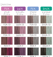
一方アジア諸国で流通している欧米系メーカーのカラーチャートは日本のメーカーさんがつくる理路整然とわかりやすいチャートではなく色相と明度の関連が理解し難いチャートで日本のカラーチャートで慣れている我々も理解し辛いものなのです。もちろん黒髪に染めた場合と白髪に染めた場合という様な親切丁寧なことなどありません・・・というより欧米の人は元々髪の色が明るいので黒髪に染めるイメージは必要ないのだと思います。そしてご覧の通り色相の配置は感覚的な世界かもしれません↓
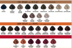
このようにカラーチャートの表示方法にもこれくらいの差があるのです。
”色物商材”(カラーやメイク化粧品)と”色恋” の2つの ”色” を引用して ”色の道は難しい” と当社の歴代先輩からの言い伝えがあることを思い出した海外出張でした。(笑)
——————————————————————————————————————
Hairdressing and Beauty in Asia Part 3: Fashion Color
• June 10, 2022
A story about how we learned that our common sense is the insanity outside Japan.
When I was in my second year in charge of overseas sales, I was pulling out past data and scrutinizing its contents in order to formulate strategies by country and customer based on the annual sales budget.
What I found there
was the lack of sales results for technical products. I realized that while we had a good track record in sales of hair care and styling products for in-store use, we had little perms and color products for professional use and decided to focus on technical products and promote hair color, which is popular in Japan.
Among the category, fashion color, for I knew little that this would later prove to be a hardship.
During my previous overseas business trips, I had not seen many well-known Japanese manufacturers entering the Asian market in the hair color genre, so I easily thought that this was a business opportunity (I assumed it was a blue ocean). The manufacturer whose lineup I was promoting at the time had also launched a line of gray colors first and had launched a new cold fashion color under that brand, so I took advantage of that trend to make a sales pitch. Before going on a business trip, I sent the materials I had translated into English to the client and asked them to read them. After that, I sent samples to them for testing, and then went to see and interview the client about the impression after use. After completing a series of arrangements, I arrived at the site with high expectations.
Their answer was “It’s not dyed, it’s just a little bit lighter.”
When I unraveled the story, it seems that their image of the colorant is that it uniformly produces the same color regardless of any original color of the hair (undertones) to be dyed.
For example, we understand as a matter of common sense that dyeing 12-level ash into black hair is different from dyeing 16-level hair, but our common sense was their insanity.
So, I explained, “If you draw a picture with colored pencils on a black drawing paper, you can’t see what I wrote, right?” Then, “If you draw a picture on a white drawing paper with colored pencils, you will see what you have drawn, right?” I explained to him that the coloring would be different if the hair color to be dyed was different, which he understood, but he said it would be meaningless if the hair was not dyed. It took some hours to explain. I guess the interpreter was the most tired. I assumed that if this was going to happen at the agency, it would be the same at their client salons. On the other hand, I took this as an opportunity to make sales pitches over and over again, proposing new approaches and training courses, but even after handing the responsibility to my successor, until now, fashion color has not been introduced at this agency, and many years have passed.
There are many factors to this result, but I believe the biggest difference is the concentration of the second agents. In Japan, the concentration of the second agent is 6%, whereas in Europe and the U.S., a concentration of 12% is used. And this distributor handles Italian colorants. I think this double difference in concentration makes a big difference in coloration. It is beyond our sales force’s ability to do anything about this, and it may be natural for them to think that the colors produced using 6% are not good enough if they consider the color produced using 12% to be the standard, and that the color identification stickers attached to the colorants themselves do not match the colors of the products.
I felt that there was a good reason why I did not see many colorants there, even those made by very famous Japanese manufacturers. I also realized that it was really shallow of me to think of it as blue ocean and consider it a business opportunity.
Additionally,
the Japanese hair color chart is easy to understand theoretically, with the vertical axis representing lightness, the higher the number from the bottom to the top, the brighter the color, and the horizontal axis representing hue. The left half of the chart shows the image of coloring black hair, and the right half shows the image of coloring gray hair or bleached hair of about 18 levels.
In other words, it shows two prerequisites so that users can easily visualize the coloring conditions.
On the other hand, the color charts distributed in Asian countries by Western manufacturers are not the same as those produced by Japanese manufacturers, and the relationship between hue and lightness is difficult to understand, even for those of us who are used to Japanese color charts. Of course, there is no such thing as a kind and polite “dyed black hair” and “dyed white hair”, because there is no need of “dyed black hair” for Western people. And as you can see, the arrangement of hues may be a sensory world.
This is how much difference there is in the way the color chart is displayed.
“The path of color is difficult,” quoting two “colors” in “color products” (hair color and makeup cosmetics) and “love affair (the word ‘color’ is used as love affair in Japanese).” I was reminded of the saying from our company’s past seniors on this overseas business trip.